Friday, 26 October 2012

Progress Review Complete! Where do I go from here?

Hmmmm well that was a disaster! Unfortunately my tutors didn't like any of work so far or my idea OR my statement... so basically everything, oh! but they liked my blog.

I'm really disappointed with my result, thought I was finally getting somewhere. But I'll take it on the chin and move on.

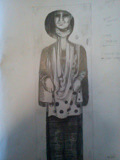
They only pieces my tutors liked were these (below). My friend climbed into the box as a joke but it had a interesting outcome and I decided to sketch her inside the box when it was standing upright. As for the little guy with his hand out, I simple cut off a layer of the cardboard to give that effect. It is one of three pieces that make up a little animation.


So what all these pieces have in comon is that they involve a different type of space, Confined Space. One of tutors gave my advice of looking at coffins and starting talking about mummified people but to be honest I hate zombies and mummies and that sort of thing... creepy! But I see where he's advice is leading.
 
I have decided yet again to start anew because obviously what I was doing wasn't any good. My theme is still personal space but I'm going to focus on Confined Space rather than Sharing Space.
I'll start off by documenting small cramped spaces or small slits in walls or whatever that have larger/smaller spaces hidden behind them or perhaps things protected by a outer shell... similar to a coffin, body is protected by a outer shell. I think a few people might have a similar idea so I have to be careful and not come up with a idea very similar to someone else's.
 
I have a long bank holiday weekend to think my ideas through, hopefully goes well since I'm a bit off track at the moment...
... Stay chuned!!

Monday, 22 October 2012

Blog Review and Progress Review

Blog Review

I had my blog review recently. We just connected the computer to the projector and went through the blogs. Everyone had to explain their blog, going through each post and what it was about. Wasn't anything too difficult.
 I was the second person to speak about my blog, I just scrolled through it and gave a little explanation for each post. In one of my blogs there is a picture of my friend lying in a box and looks alot like a coffin, my tutors seemed to have found that interesting. Then we were talking about history and coffins.
 I only spoke for a few minutes and then it was the next persons turn. I kept an eye on my tutors and they responed with nods to everything I said... I take that as a good thing. The tutors didn't say anything bad about my blog or areas to improve, so I presume I'm doing it right!
Overall it was a simple review and I had no negative comments thankfully.


Progress Reviews

I have my Progrss Review on the 25th. Everyone is in a panic trying to set up their displays of work. Hopefully it won't be too bad and is something similar to a tutorial. Just explaining your idea and the work you've done and they look through your contextual book and sketchbooks. We were asked to write a statement too. Just a basic outline in bullet points of all the work I've done so far. I already have it written out but I think I'll type it out and print it on the computer instead... It just looks better!

Sunday, 21 October 2012

Latest work and Limerick City Gallery Exhibition

I was looking at body language and hand gestures and decided to draw different types of hand holding. Hand holding is a affectionate way of sharing your space and can have different meanings attached to them whether it's friendly, romantic, comforting or simple a parent keeping their child close and safe.


 I then decided to experiment with some cardboard. I simply removed a layer of the cardboard to give this effect. It's a three piece simple animation of how one can feel trapped or alone till someone else gives you a helping hand.


I did the same thing with the cardboard but this time with a different image. This relates to my study of hand holding.


Remember my friend in the box? I did drawing of her in it. Looks awfully creepy! I guess it just adds to the creepy coffin affect.


 These are just some quick sketches of the wire people I made.
 

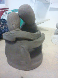
This is a plan/ design of a clay sculpture I want to try and make. It's a abstract sculpture of a hug.
 

Result didn't turn out very well.
 
 
Limerick City Gallery Exhibition
 
I went the Limerick City Gallery and really enjoyed it. The pieces of work were all individual ad unique. There were mainly pieces involving film and videos on different monitors, these videos control the viewer in what the artist wants you to see and also confusing you by playing many monitors at once making you unsure which one you should follow first. There was also pieces of sculpture.
 
I immediately noticed and liked this piece. It also relates to my project. A hollow figure, protecting him/herself from what you would presume to be rain and also protecting another figure under the arm. These two figures are sharing close intimate space, the larger figure holding the smaller one close protecting it from the rain. Is it a couple or a parent and child? It's a simple form of sharing your personal space with another.

 
I really liked this piece. It doesn't relate to my project, I just liked it! A entire room full of suspending swings, each one either slightly in motion or completely still. 
I like the interaction with the piece. Your able to move among the swings and as you do you may bump into them causing each one to move. I found myself really wanting to sit and swing on them... but I resisted!! Is this the meaning behind the piece? Hacking into your inner child and reminding you of nostalgic times when you were a child?


Thursday, 18 October 2012

Sharing your Personal Space

I have finally decided to settle down and focus on the topic of sharing your personal
space with others. I'm looking at different types of relationships such as family, friends and romantic relationships and how these can be expressed visually in an art form.

I started by making simple wire sculptures. Exploring different forms of sharing your personal space with others through different gestures. Holding others close to you is the most common form of friendly/ romantic gestures. Body language is another big part of this subject, whether or not that person wants you near them.


I plan on making a series of different small figures out of different materials. Recently I made simple looking figures that look a lot like chess pieces with arms, out of clay and made little animations or scenarios with them. I also plan on making making a large amount of these. Hopefully this would have a more dramatic effect rather than just having a few little sculpture's sitting on the table. All of which will be different materials. I plan on making more simple figures out of ice/ wax and melting it, taking pictures as it melts which would be like a metaphor for old age and plaster so I can make many copies quickly and easily. Perhaps I'll experiment with latex too and see what that's like.


Remember my experiment 'claim your space' with the big box? I decided to experiment a little more and cut a figure out of it. What's left of the box is a bit ruined! The figure I did simply with the common symbol used for men... Like the sign on the male toilets! I placed my cardboard man under my table all curled up, he's meant to look lonely but actually looks like a lifeless body..whoops! Maybe it'll get a interesting reaction from the people who see it.


The 'claim your space' experiment was a bit of a failure. But! People enjoyed and had fun drawing and writing on it so in a way it was successful! The main point was for others to enjoy it!!!
 
 
I then wanted to see what it would be like if someone got inside the box. Looks alot like a coffin! It was interesting..and funny watching my friend adapt to the small space so she could step inside. This relates to a previous subject I was researching, 'Adapting to your space'.


Thursday, 11 October 2012

Latest Tutorials

Tutorial 8th Oct

I had a tutorial on Monday with one of my tutors. We brainstormed together and I explained my idea of different types of space. Adapting to space, we brainstormed mazes, obstacle courses, playgrounds and that sort of thing. Sculptures that force the viewer to adapt to a space by having to move round, though, over or under. He then started looking at my sketchbook. Immediately pointed out that I'm thinking more on the end result rather than the journey! I realise this myself now I look at my sketchbook. Once I get ideas for pieces I like to write the down.

We then came across a sketch in my sketchbook where I was exploring the sense of depth. We then started brainstorming again and I was told some interesting stories by my tutor from his life that deal with depth. His main point in telling me those was to make something important to me! Something I'm passionate about and it will show in my work.
They were the main points, make the journey not just the end results and be passionate abut what I'm making.

Tutorial 11th Oct
Little mouse exit
Today I  had another quick tutorial. My tutor had a quick look through my contextual notebook and sketchbook and then had a look at my little experiment that was in the hallway. My experiment was "Claim your Space", simply a big cardboard box and I allowed everyone to write and draw whatever they liked. I noticed that when people don't know what to draw they just write their names, which is the best way to claim something. Once your name is on it it's considered your property! We've all done this throughout our lives on different things. Unfortunately the next day I returned to the college to check the piece, it was covered in rather rude drawings. Which I had expected!
There was a glimmer of hope for some creative students who actually used their skills to draw or crave into the box.


Unfortunately my little experiment didn't go down to well with my latest tutor and I was told to through it in the bin. Straight to the point, which I like! Bye bye box!!! I'll get rid of it next week since I have no use for it now.
 
I was told to focus more on my idea of relationships and sharing your personal space with others. She found my little wire sculpture of people hugging interesting.
 
 
Now I think I'll focus on this idea for a while and see what I come up with............
.....Stay chuned!!!!


Colour and 3D Studies


I had another two sem dem's on Monday. Colour in the morning and 3D Studies in the evening.

Colour
We were shown how colour and influence the viewer and change a painting. Colour can be used to break up a painting but mainly to catch the attention of the viewer. A painting with colour is more likely to catch your eye rather than a black and white painting.


During our sem dem we were shown some videos that have a great sense of colour. The Sony Bravia advertisements were really good! Looks like it was lots of fun too! Coloured explosions throughout a apartment block and surrounding areas. Raining bold bright primary colours far and wide.

 
"Don't pick any yellow, pick the right yellow!!". Deciding on appropriate colours is very important. Don't choose any old colour just for the sake of it. Choose colours that compliment the piece, that work well together, that may have a underlying meaning or emotion attached to it. Doing this greatly adds to the effect of your piece.


3D Studies
3D would be physically manipulating materials. Making sculptures. Pieces that no longer lye on a flat surfaces such as drawings on paper, card etc.
This is a great way to explore different textures. materials, shapes and size. 3D pieces can be very effective, some are complicated, some simple, some huge and some small. Like every piece of art every 3D piece is unique. Personally, I like paper sculptures. I like the clean sharp lines and purity of white paper, but the coloured paper is also very effective.
 
We were shown different artists and the pieces they created. We were also told that there will be 3D workshops. I hope to sign up to at least one of those.
 
Turning a 2D into a 3D


Tuesday, 2 October 2012

Semiotics and Composition

Monday's I have two seminar demonstrations, sem dem's as I like to call them. This week I had Semiotics in the morning and Composition in the evening.

Semiotics
The easiest way I can describe Semiotics is through an example. The example given to us was a picture of a pipe and we were asked what it was. We instinctively replied "it's a pipe!". It's not a pipe, it's a picture of a pipe. Basically it's a sign that signifies a meaning or object.


We then talked about Frank the ham sandwich. Was a funny way to each us about Semiotics, makes what could be a dull subject to some people into an enjoyable one. Basically Frank the ham sandwich was used as an example of how you can take apart an idea piece by piece and how every idea has different layers.

So! the theme is sense of space...
Space
Peronal space, private space, Confined space, Vast space, Invading space, Sharing space, Protecting space, Negative and positive spaces, Spaces between objects or people, outter space, how something affects a space....
 
Sense of Space
Senses: touch, sight, smell,taste
Emotional senses: fear, uncertainty, relief, expectation, excitement, curiosity
 
The list is endless as long as you use your imagination! I found this way of breaking out the ideas to be very helpful in giving new ideas rather than being stuck on the one idea.
 
 
Composition
This is an easier concept to grasp. Composition is basically the structure or layout of a 2D piece, such as drawing or painting. When you look at a piece, the features in a painting aren't just randomly placed there or the artist just felt like putting it there. It's placed there for a reason!! There's structure to each piece to make it more effective and draw the viewer in. Lines to focus the viewer on a certain point or pyramid compositon to guild the painter to paint in that shape. Pyramid composition is used alot for groups of people or portraits I noticed. Using the most famous example, the Mona Lisa is pyramid compostion.
Portrait figure is in the shape of a pyramid. Gives it balanced structure. 
Above, Composition is used to give the illustion of a wavey structure on a 2D surface, simpley by changing the direction of the lines.
 
Composition here (above) is using lines to draw your eyes to the centre, giving the illustion of depth.