I'm still working on my little animated photography journey. I'm not very skilled at photography but I'm giving it a try. My little clay dough men are the main focus in the photos and the background blurred. You get a sense where I have been though, what I stopped to look at. Obviously I don't take account of absolutely everywhere I have been or else I would have a huge amount of photos. I have to be selective with my photos, then perhaps I will pick my best 10 to present for my studio assessment, the rest will be in a sketchbook if the tutors want to see them or else I will put them here on my blog.
After a quick tutorial I was told it was good to have series of pieces, it shows development of an idea and exploring it in different ways.
I had then sorted out the layout of my wall a bit and cropped some pictures to stick into my sketchbook. Looking at the long strips of leftover paper I came up with the idea of drawing a simple little animation on each strip creating a small story... like comic strips I guess. My tutor passed by my desk again asking did I just draw them and she liked it and said do a series of them so that's what I did. It lots of fun drawing these small little animations based on my dough men character... I'm keeping it linked to my project without drifting to much away from it. I think my main inspiration came from the artist Jacob Stack. Here is what I came up with:
Three strips, drawn with pen on tissue paper. Very little drawing involved to tell the story. Due to the length of the strips, this descending from a rope animation was quite fitting I thought.
I then developed on this idea by making a series of different animations. I bought a large sketchbook to dedicate to my animations. Keeping my two main areas of interest separate but both included in my project and lined together. Here's the other little stories I came up with:
These were drawn with pen on spare pieces of cardboard and using paint to add a small bit of colour. I like how the animation is broken up into different segments. Each has it's own little story yet all these little stories are connected to make a whole. Also by manipulating the angles of the pieces of cardboard adds to the story.
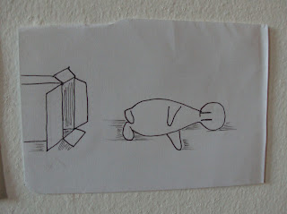
This animation was drawn with pen again on paper. This one relates to my idea of the human figure in an confined space. Also a while back I was using boxes, so I combined the two and came up with this simple animation. I particularly like how I laid these animations on my wall (as you will see in the next photo).
For the cardboard animation I connected the cardboard pieces just enough to link the story together. I also slanted one piece to add to the lower part of the story where my little characters are slipping off the cardboard. For the animation on paper I simple changed the direction of the story when the character falls out of the box. It adds to the aesthetics of the piece rather than just having the story move horizontally.
This is my little cute version of Romeo&Juliet, simply because it randomly came up in conversation and I decided to draw it. That's the great thing about animation, you can make a classic story your own for example. Again very simple drawing and enough detail to get the story across.
I then decided to lengthen the story. Make the viewer stop, and follow the story. I did this by just adding more segments. Here's a close up of the one above:
A combination of drawing and painting on the cardboard and the paper.
Well that's all for now folks. Hope you enjoyed getting animated !!! :)


No comments:
Post a Comment